← Work

Blackstone Design System

FintechB2BScale
Blackstone Design System in React
The React component library, with 30+ components across 41 product sites, documented with usage guidelines and accessibility annotations.

The Problem

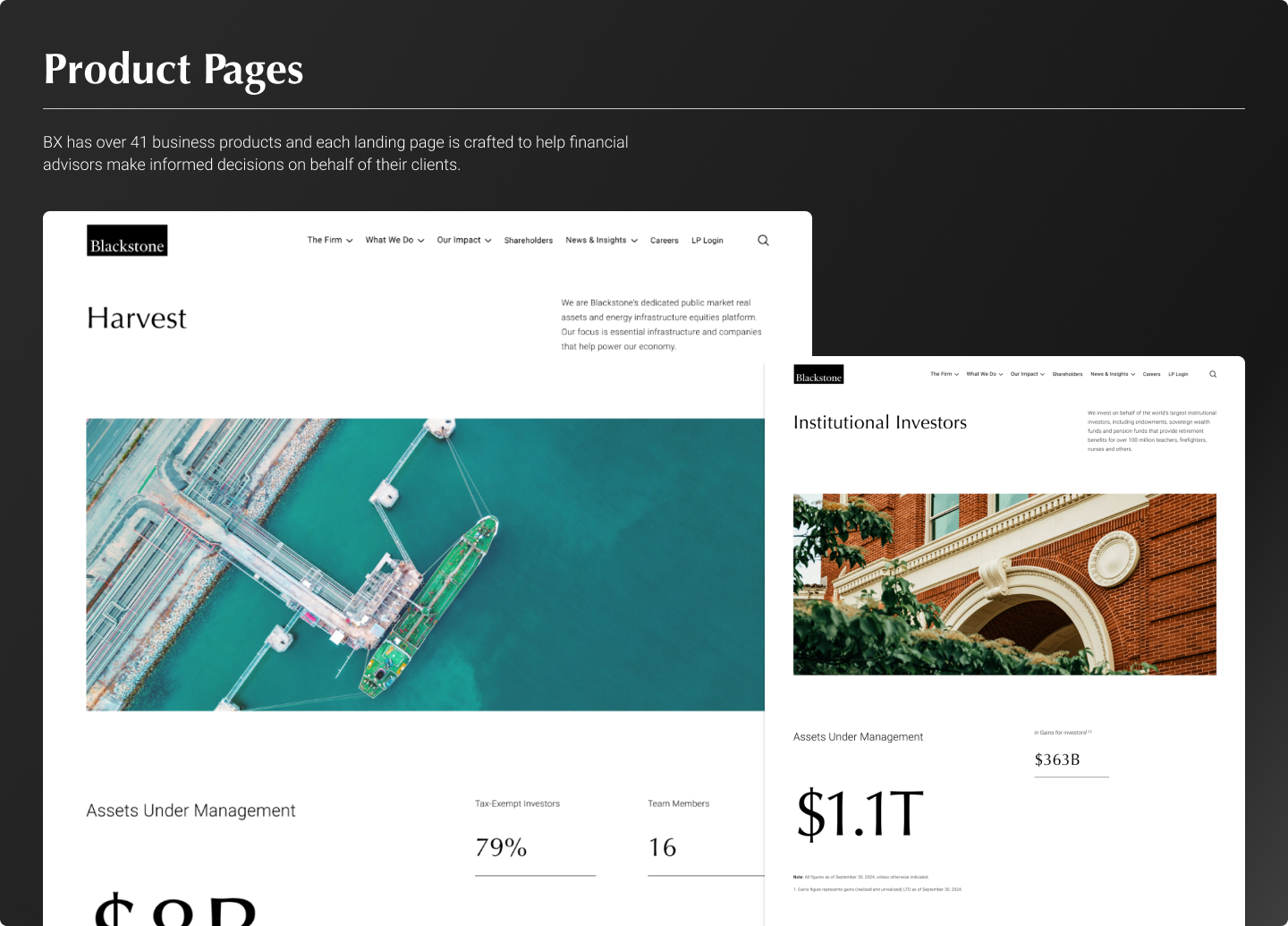
Blackstone's product suite had grown to 41 enterprise sites with no shared design language. Each designer and engineer rebuilt components from scratch, creating visual inconsistency, slowing shipping velocity, and generating constant rework across the organization.

UI audit showing inconsistency across product websites
A UI audit comparing button styles, type scales, and color usage across 24 product websites before the design system.

Token Architecture

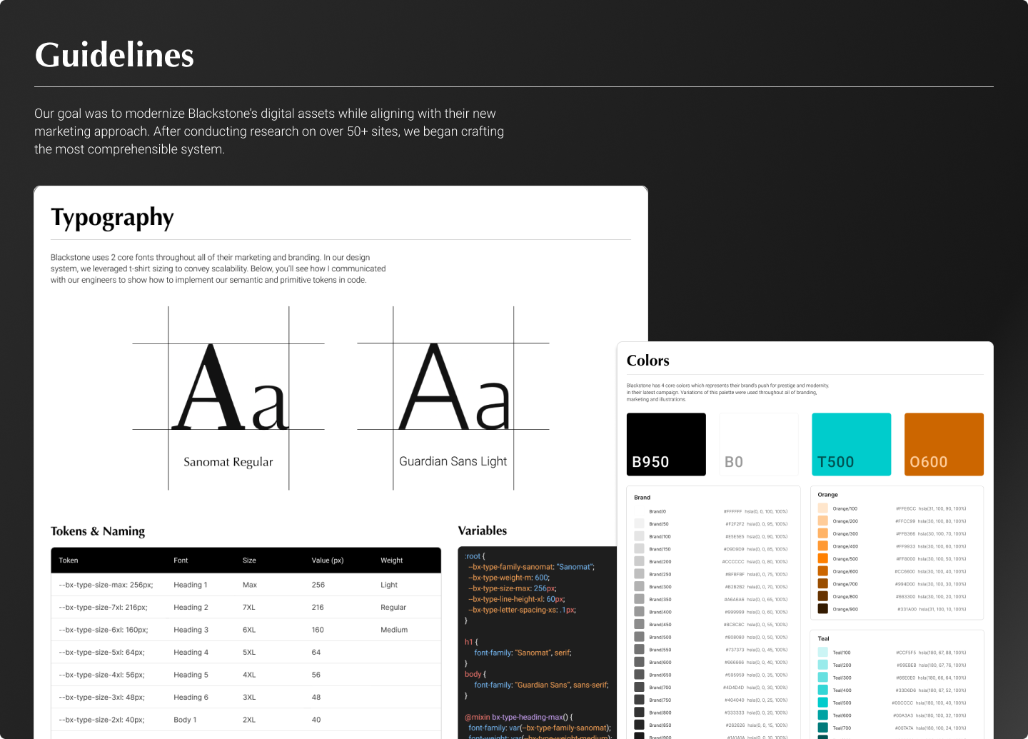
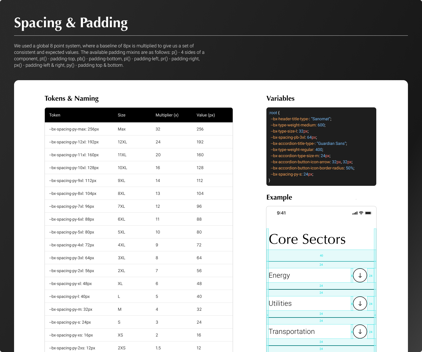
We adopted a three-tier token architecture — primitive values mapped to semantic tokens mapped to component-level tokens — enabling per-brand theming without forking the system. Tokens were version-controlled and published via GitHub CI/CD pipelines.

Design token hierarchy: primitive → semantic → component
The three-tier token model. Primitive tokens define raw values; semantic tokens define intent; component tokens define usage. Brand themes swap the primitive layer without touching components.
React component documentation
Component documentation in React, with each component ships with usage guidelines, prop tables, and do/don't examples.

Outcome

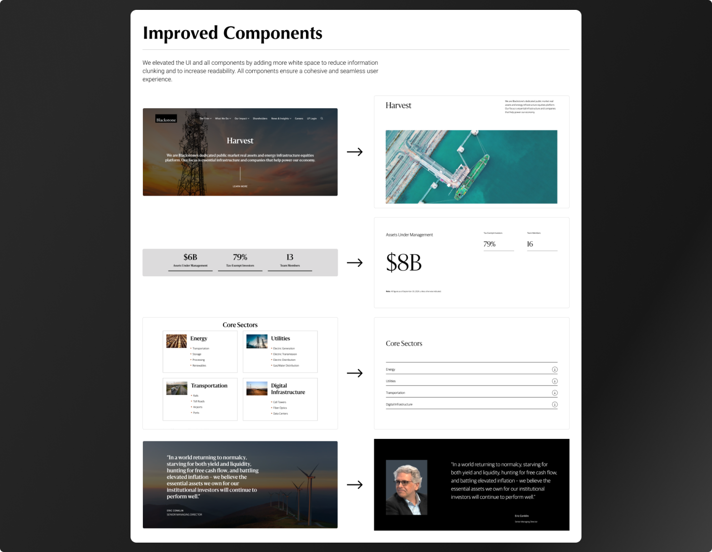
30% reduction in design iteration cycles. 41 enterprise products aligned on a single shared system. Measurably faster feature shipping velocity across product teams, with newly onboarded engineers productive in the design system within their first week.

After: visual consistency across products
The same 41 product websites from the audit — now visually consistent, using shared components and tokens. Before/after is the most powerful proof of system impact.